What is a Data Dictionary
Data Dictionary is a metadata to represent the structure of a table and its visualization in a CRUD (registration screen where the user can Create, Read, Update and Delete records).
Here you can manage and configure the functionalities and characteristics of this CRUD at runtime. Metadata is parsed into JSON by default and stored in a table in the database, but it can be stored in files or anywhere else, for that see the system configurations.
Creating a Data Dictionary
You can start through the link /en-us/DataDictionary.
The New icon will allow you to create your metadata and generate scripts for your tables.
With JJMasterData you will be able to import or create your table and organize it into dictionaries and later displayed in metadata.
Adding a new Data Dictionary
To create the data structure directly by JJMasterData it will be necessary to leave the field “import field” unchecked, insert the name of the table to be created and click Next.Importing a Data Dictionary from an existing table
To create a data structure with JJMasterData using an existing table in your database, it is necessary that the “Import field” field is checked and the database connection user has permission to read the table structure. The Table Name field will be filled in with the name of the existing table and click Next.
After you will access the Entity window and you will find the following items:
Entity
- Element name: It will be the name that will represent your metadata.
- Table Name: Name of the table where your records will be stored.
- Get procedure Name: Name of the procedure that will read the records. You can view the procedure created by clicking on more, Get Script and then Get Procedure.
- Set Procedure Name: Name of the procedure that will write the records. You can view the procedure created by clicking on more, Get Script and then Set Procedure.
- Title: Here you will fill in the title that will be displayed inside the Form. It will be possible to enable or disable the visualization of the title through the internal settings.
- Subtitle: Here you will fill in the subtitle that will be displayed inside the Form. Just like the title, the subtitle can also be enabled or disabled.
- Info: Free text information for internal use that will be shown to the developer.
Fields
The next step is to access the Fields area, where you can fill in and format the form fields.
Tip
After completing all required items, you must perform another action before the table is definitely created. you will access the More option on the right side of the menu and click on Get Script, in this way the scripts will be converted to an SQL script and will be displayed to you. After displaying the scripts, you will have the option of executing the stored procedure, if there are no procedures to be executed, just click Run All and save the page by clicking at the bottom. Okay, now your table is created. By clicking on the Exit button, at list of Data Dictionaries, when locating your table, click on the icon on the right next to the edit button, so you will see the Preview button, it will let you see what the final display will look like.
The Fields are separated in following areas:
General
It's required to fill in the following fields: FieldName, Filter, DataBehavior, Data Type, Size, Required, Pk, Identify.
- FieldName: This name is used to refer a field and will be related within the database.
- Label: Label that will be displayed in a form
- Default Value: An expression that will return a default value if the value inside the database is null.
- Filter: Field that indicates a type of filter that will be executed in the get procedure
- DataBehavior: Data behavior
- Real: Will be used in Get and Set;
- Virtual: Not used in any db operation;
- WriteOnly: Will be used only in Set;
- ViewOnly: Will be used only in Get.
- DataType: Type of data that will be received from the table.
- Size: Number of characters and when used as Varchar it will be the size to be reserved within the database and the max length in the form.
- Required: It will define the required filling of the field.
- PK: Define whether or not it's the primary key, it's important that you fill in one of the items in your table as the primary key.
- Identity: If the field will be auto-incremented, for example, if it will automatically return a field from within the database.
- Help Description: Message to be displayed to the user in a tooltip to help him.
Component
- Component: Component used to render a specific field within the grid and form.
- AutoPostBack: true if an automatic postback occurs when the component control loses focus; otherwise, false. The default is false.
- Placeholder: Will show a note for the component when there is no data included.
To upload see Configuring Data Upload
Advanced
Advanced Settings in a component
Expressions
Expressions Any fields and actions supports expressions
What is a expression?
Expression is a simple way to return a dynamic value from a string.
How it works?
Expressions can return a boolean or a object value at runtime
Example:
"val:1" Return true.
"val:0" Return false.
"exp:1=1" Return true.
"exp: {IsList}" If at the list state return true
"exp:'{pagestate}' = 'UPDATE' AND '{ID}' = '1'" If update and a field value ID equals 1 return true
Don't forget to add single quotes, if your value is a string or can be null, because it will be replaced at runtime
In the Data Dictionary UI, the expression editor is simplified like this:

What are the default expression providers?
- Type [val:] returns a value; (1 or 0) (true or false) ("foo") etc..
- Type [exp:] returns the result of the expression from NCalc;
- Type [sql:] returns the result of a sql command;
Tip
Check if your field supports all expressions checking the attributes of the desired property at the docs.
Tip
SQL Expression values will be replaced with a SQL variable to prevent SQL injection attacks.
How to do it?
Building an expression
Warning
Contents enclosed in {} (braces) will be replaced by current values at runtime. Following the order:
MasterData keywords
- {PageState} = "INSERT" | "UPDATE" | "VIEW" | "LIST" | "FILTER" | "IMPORT"
- {IsList} = 1 | 0
- {IsFilter} = 1 | 0
- {IsView} = 1 | 0
- {IsInsert} = 1 | 0
- {IsUpdate} = 1 | 0
- {IsDelete} = 1 | 0
- {IsImport} = 1 | 0
- {ComponentName} = Name of the component that the field resides
- {FieldName} = Name of the field that triggered the AutoPostBack event
- {UserId} = Identifier of the authenticated user, can be recovered from UserValues, Session or Claims
- {UserEmail} = Email of the user recovered from the Claims
Dynamic values will be recovered in the following order:
- MasterData keywords
- UserValues
- FormValues
- UserSession
- Claims
Examples
Example using [val:] + text
- val:a simple text;
- val:10000;
var field = new ElementField();
field.DefaultValue = "val:test";
Example using [exp:] + expression
- exp:'{field1}';
- exp:({field1} + 10) * {field2};
var field = new ElementField();
field.DefaultValue = "exp:{UserId}";
Example using [sql:] + query
- sql:select 'foo';
- sql:select count(*) from table1;
var field = new ElementField();
//In the runtime this will be replaced with select field2 from table1 where field1 = @field1
field.DefaultValue = "sql:select field2 from table1 where field1 = '{field1}'";
Types of Expressions
- Default Value: When the value is null or empty, this expression will execute before the trigger to populate the value
- Trigger Expression: This is always executed after an AJAX request to reload the form or when the form is first opened.
- Visible Expression: Controls the field visibility, and must return a bool value.
- Enable Expression: Controls if the field is enabled or not, if the field is disabled, the value is not sent to the server, and must return a bool value.
Implementing your own expression provider
You can implement both <xref:JJMasterData.Core.DataManager.Expressions.Abstractions.IBooleanExpressionProvider> (used at visible and enable expressions) or IAsyncExpressionProvider (used at triggers and default values.).
You can call ExpressionHelper to replace values {} with runtime values.
At your Program.cs simply:
builder.Services.AddJJMasterDataWeb().WithExpressionProvider<TMyCustomProvider>();
Executing C# code at your expressions
You can execute C# code using the following example;
Program.cs:
builder.Services.PostConfigure<MasterDataCoreOptions>(options =>
{
    options.ExpressionsContext.Functions = new Dictionary<string, ExpressionFunction>
    {
        {"now", _ => DateTime.Now},
        {"myAwesomeFunction", args => MyCustomClass.Execute(args[0], args[1])}
    }.ToFrozenDictionary()
});
At your expression:
exp: myAwesomeFunction('{StringValue}',{IntValue})
CssClass
It's possible to insert several Css classes and create responsive layouts using Bootstrap's grid system.
For example, two fields with class col-sm-6 in the form will be on the same line.
Line Group
It's the field line within the grid system. Represents the bootstrap row class.
Alignment at Grid
When you want to have control of the alignment of a field at the Grid, you can use this option to override it.
Without Alignment At Grid:

With Alignment At Grid at Right:

Export
You can define whether or not the field will be exported.
Validade Request
On .NET Framework 4.8 systems, the field will validate dangerous values, like Html tags and SQL commands.
Panels
Allows you to separate the dictionary fields into panels. But only for add, edit and view actions.
General
- Layout: It's the way the panel will be displayed.
- Expanded By Default: This option will define if the created panel will be started maximized by minimized by default.
- Available Field: Will be the items that will not be displayed as panels.
- Selected Fields: Will be the items that will be displayed as panels.
Indexes and Relationships
Both items will be used to generate information from your metadata. You can add this information by clicking the New button.
Options
Layout settings that can be performed on the form at runtime.
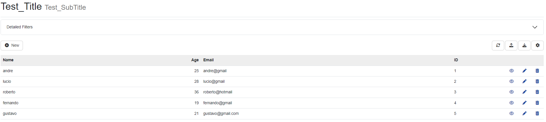
ShowTitle
Enabling this setting will allow the display of the populated title and subtitle within the Entity tab.
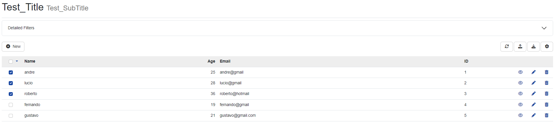
Enable MultiSelect
In this option you will need to select a Primary key to use it.
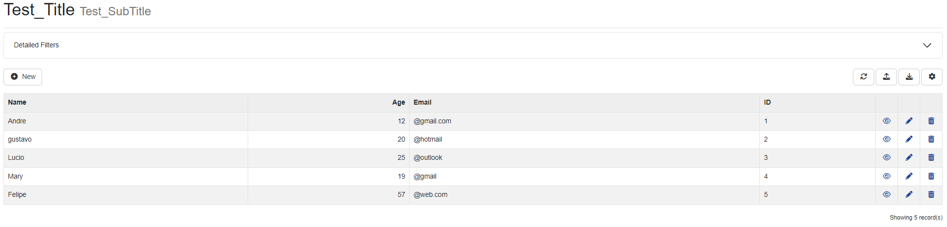
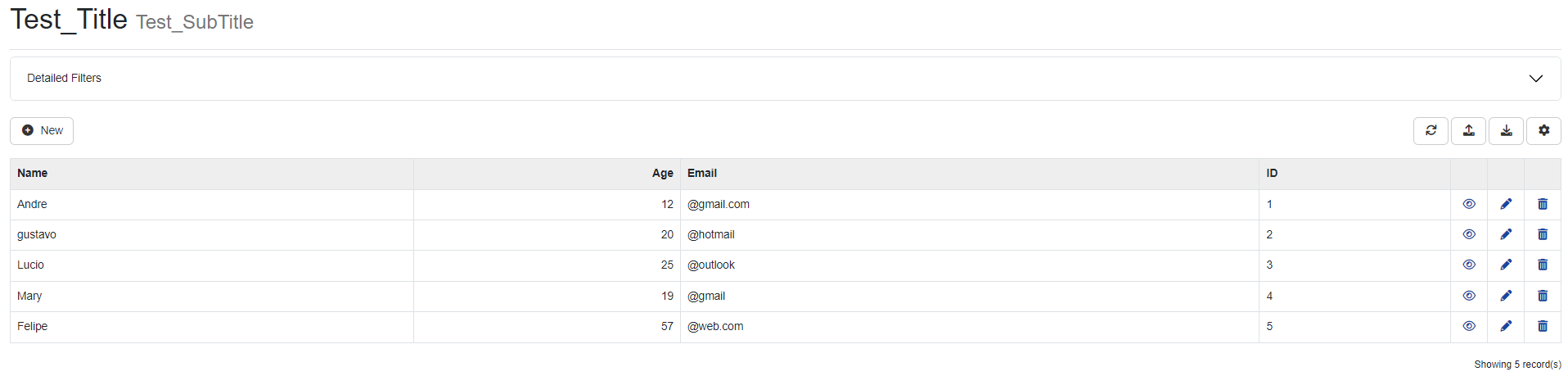
ShowRowStriped
When activating this option, the grid of your table will be displayed in a zebra shape.
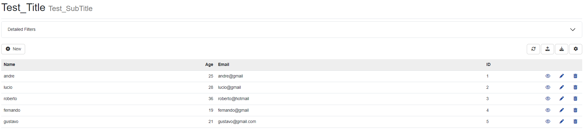
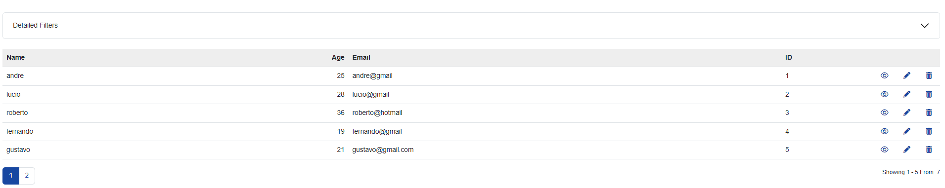
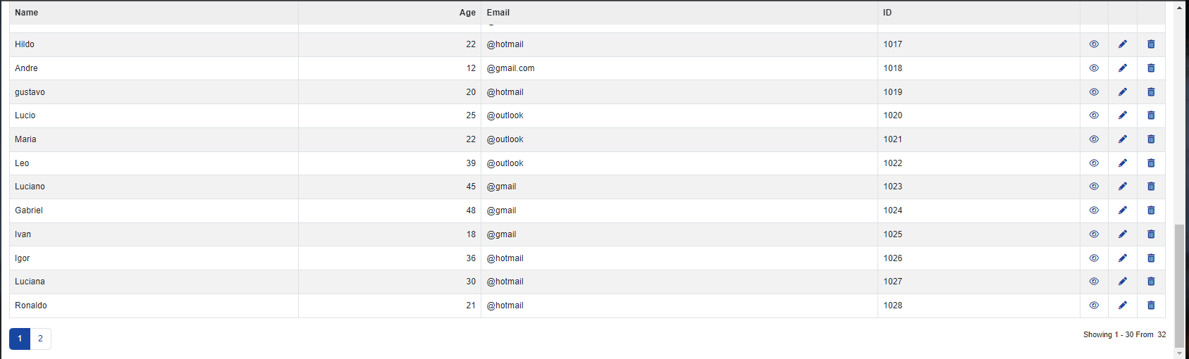
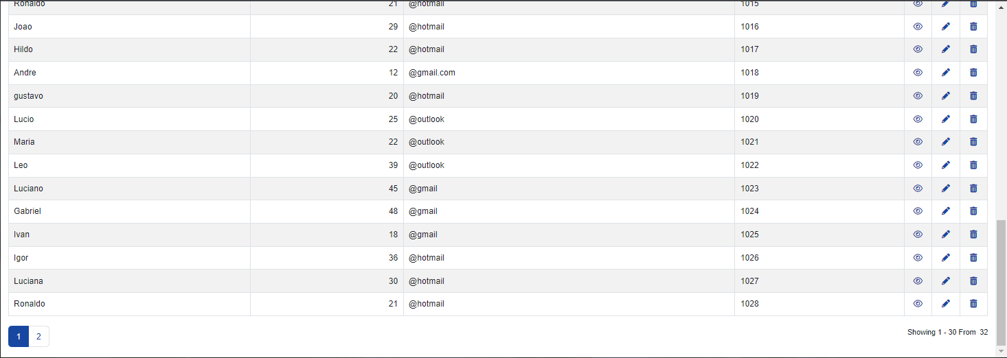
ShowPagging
Within the settings for your table, will enable the option to change the amount of items to be displayed.
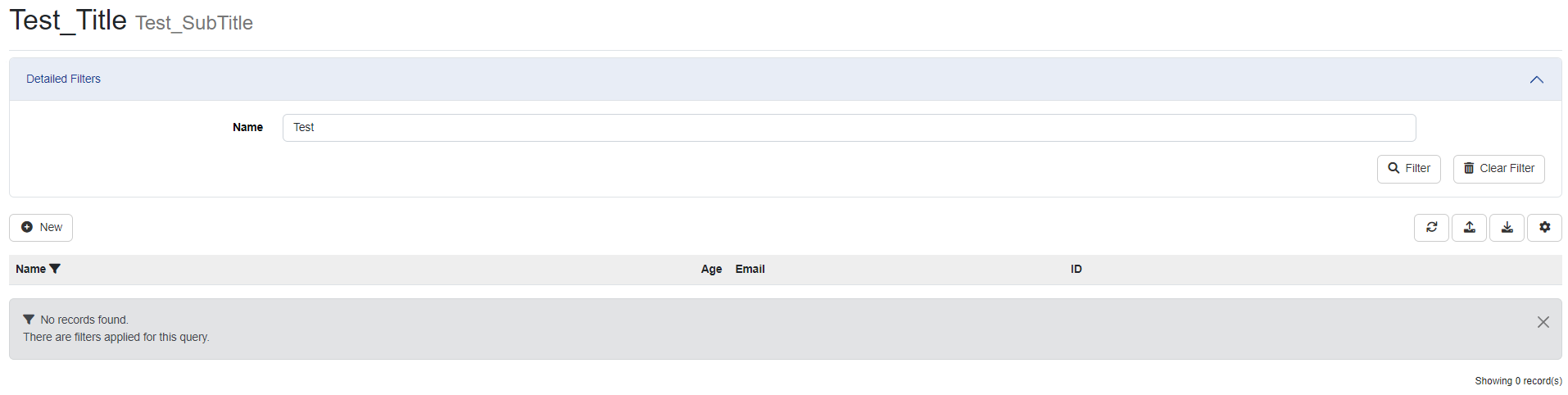
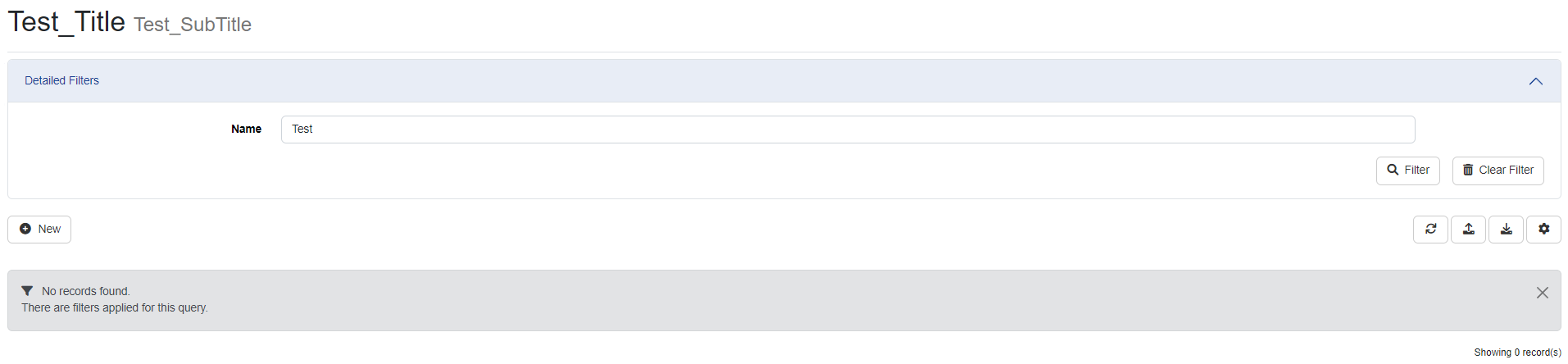
ShowHeaderWhenEmpty
Defines whether the header will be displayed when there is no response from any item within the table.
Header Fixed
When displaying multiple items from your table, you can keep their titles fixed as you scroll down the page.
MaintainValuesOnLoad
This option will ensure that your search through the filter is saved when reloading the page, whether searching for filters or configuration options.
ShowBorder
This setting will be used to display the boundary around the items present in the table.
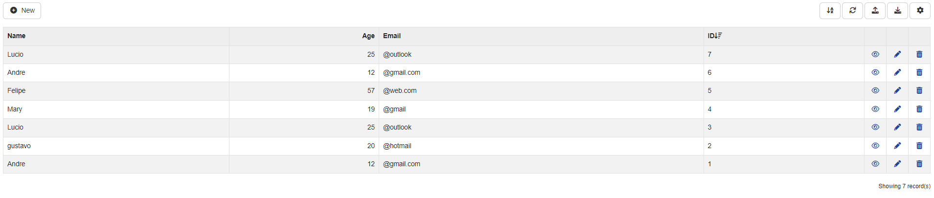
EnableSorting
This setting will allow your table items to be sorted in ascending or descending order.
ShowToolbar
Enabling the ShowToolbar setting will enable the options menu at the top of your table. Items to be added or removed can be viewed within the Action tab and then Toolbar.
Actions
Within the Actions tab you can configure the display of icons to edit your table. The Actions field is divided into two, Grid and Toolbar.
Grid
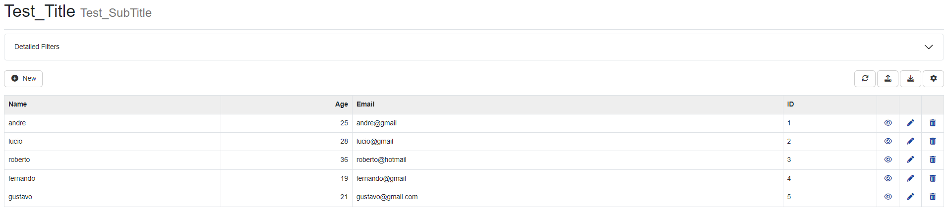
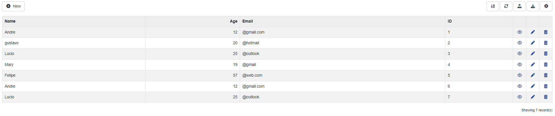
- View: This icon will be displayed next to the items in your table, you can find it when using the preview of your table. By clicking on the View button, the chosen line will be displayed in detail.
- Edit: This icon will be displayed next to the items in your table, you can find it when using the preview of your table. By clicking on the Edit button, it will be possible to change information previously registered in your data table.
- Delete: This icon will be displayed next to the items in your table, you can find it when using the preview of your table. This option will delete the desired line of information.
Toolbar
- Insert: Allows you to add new data to your table.
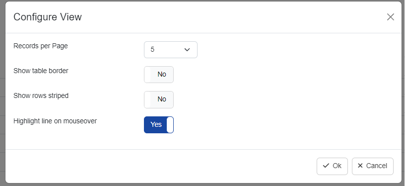
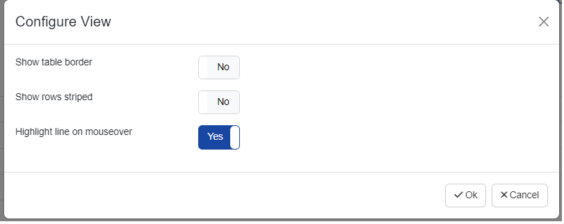
- Config: Allows you to access layout settings for the user, for example, records per page and show table border.
- Export: Allows you to select the export of the data present in the table. You will be able to import only the data visible on the screen or all the data in your table, exporting to pdf, csv, excel and txt files is allowed. If the export is done in PDF, it is necessary to enable the pdf plugin (LINK PARA DOC PLUGIN PDF).
- Import: This item will be displayed as an upload for the user, allowing the import of data to your table through txt, csv and log files. You can click the Help button to view the file upload formatting.
- Refresh: The refresh option will update your data table, in case there is any change to be displayed.
- Legend: The legend is used to help describe the data within your table, for example, you can create the legend for a gender column, where you can assign the description Woman, Man and then associate with colors and icons . You can see a complete description of how to create your legend via the link (LINK TO DATA_ITEM_LEG).
- Sort: Allows the user to order the search by items, for example, in alphabetical order.
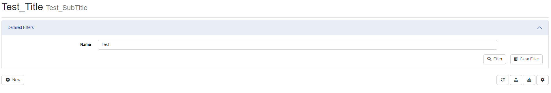
- Filter: Shows all filter options for searching items within the table.
- Log: Records and displays the actions performed within the table, including adding, editing and deleting.
API
Within this tab it will be possible to edit each verb responsible for http permissions within the REST API.
- ApplyUseridOn: Name of the field where the user ID filter will be applied.
- JsonFormat: This option will define and modify the formatting of the Json file. When using the default option, the default chosen by the user will be defined, however the LowerCase option will format the file for lowercase letters.
- Sync: This option enables or disables the REST API dictionary.